Featured
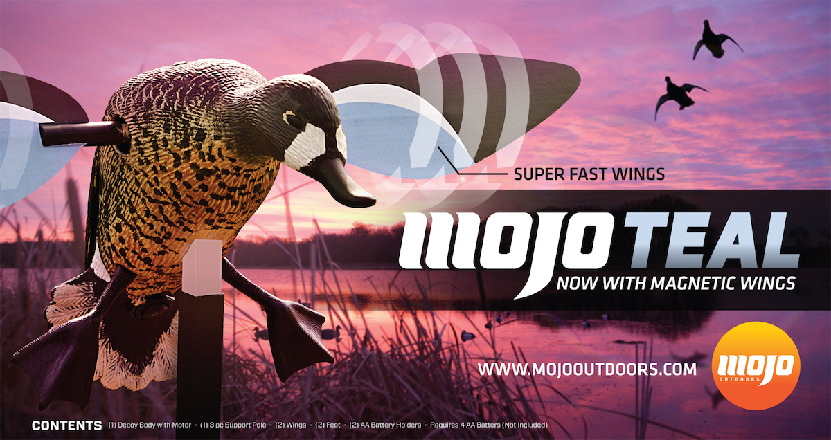
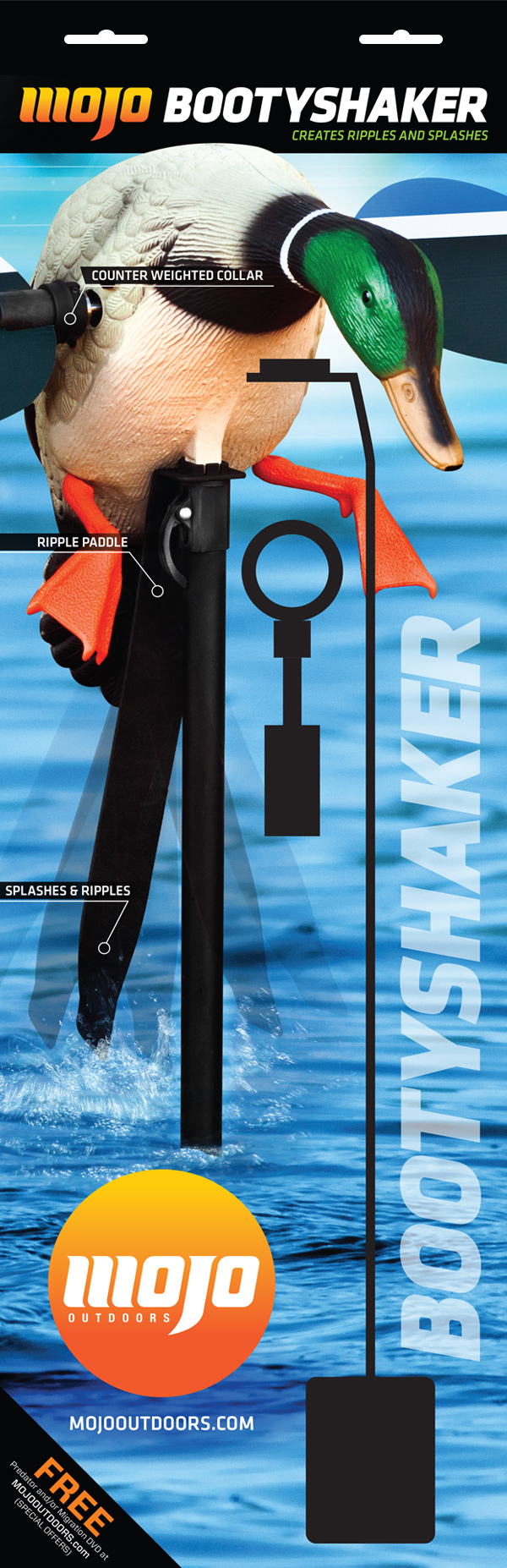
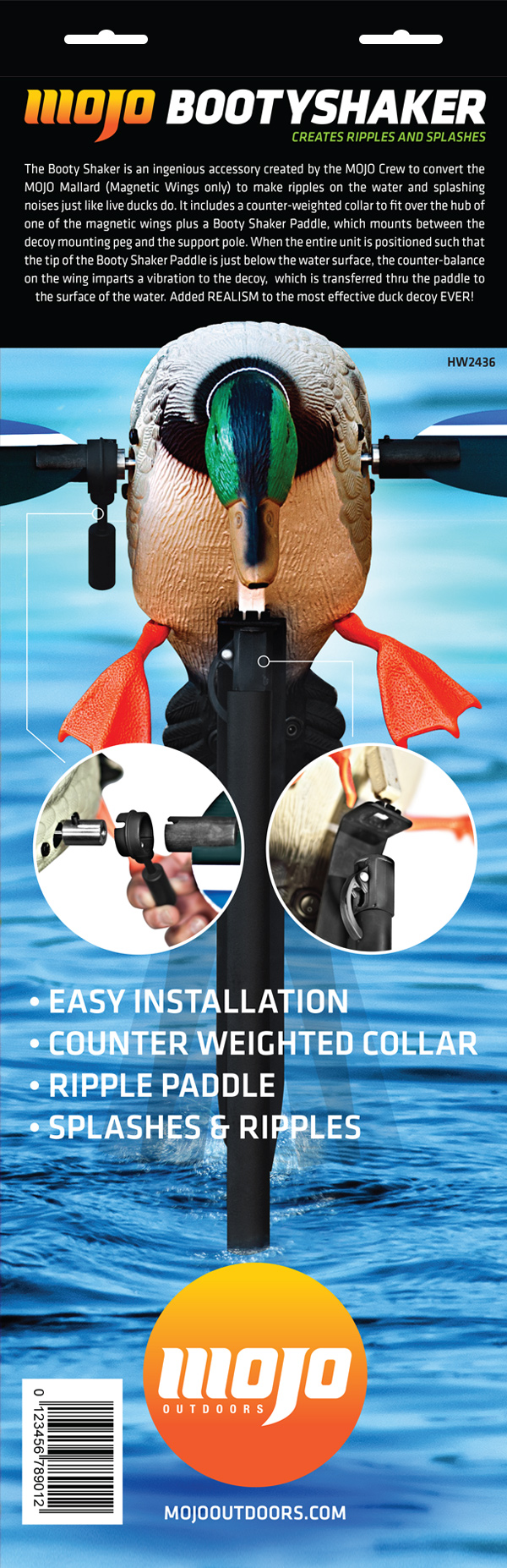
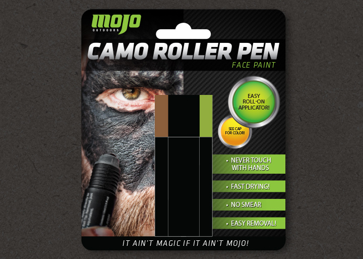
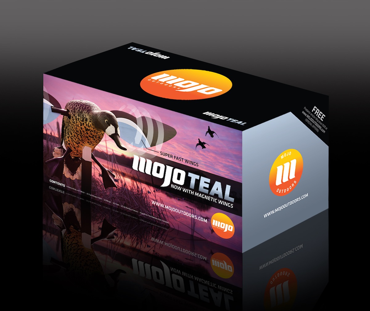
MOJO Outdoors.MOJO Outdoors wanted to disrupt the outdoor industry. Instead of the rough and grungy look, they wanted to look clean and innovative. "Where Apple meets outdoors" is the description we were given for this project. We aimed to simplify the packaging and use authentic photography with eye catching designs to make their products stand out on the shelf. We were able to keep the most recognizable part of the brand, the gradient circle, and incorporate a clean and elegant mark with multiple variations.
![MOJO Outdoors Logo Option 2](/img/mojo/mojoLogo2.jpg)
![MOJO Outdoors Logo Option 3](/img/mojo/mojoLogo3.jpg)
![MOJO Outdoors Logos Option 1](/img/mojo/mojoLogo1.jpg)
![MOJO Teal Box Front](/img/mojo/mojoTealFront.jpg)
![MOJO Booty Shaker Front](/img/mojo/mojoBootyShakerFront.jpg)
![MOJO Booty Shaker Back](/img/mojo/mojoBootyShakerBack.jpg)
![MOJO Face Paint Photo](/img/mojo/mojoCPface.jpg)
![MOJO Face Paint Photo](/img/mojo/mojoFacePaintFace.jpg)
![MOJO Face Paint Package](/img/mojo/mojoFacePaintPackage.jpg)
![MOJO Teal Box](/img/mojo/mojoBox.jpg)